As mentioned previously I've been looking at some DFC strips compiled for graphic novels. I've also been reading Marvel's, The Wonderful Wizard of Oz.What they all have in common is very simple panel layout. This is quite different to graphic novels aimed at a more mature comic reading audience. It's less playful and inventive but when it comes to communicating a story directly and with absolute clarity, quiet panel layout really cannot be beaten.
Friday 7 December 2012
Korgi
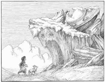
Over the past few weeks I've been looking at the complexity of panel layout within children's comics and graphics novels. I found a real gem in Korgi Book 1 by Christian Slade. Its an all ages graphic novel told exclusively through image. I confess I would never have picked it up if it were not for research purposes, wink, wink, but thankfully I did.
Christian's line work and composition are fantastic. What he excels at is his use of parallel lines to describe form and movement. This adds a real energy to every page. Nothing feels dead or static. More uniquely and more importantly to comics is his use of this technique to guide your eyes in reading the panels and moving your eye to the focal point within a frame or page. I have not seen this done before in comics in this way and found it quite exciting and fun. The pacing of the book is great as well. There's a full review here.
As mentioned previously I've been looking at some DFC strips compiled for graphic novels. I've also been reading Marvel's, The Wonderful Wizard of Oz.What they all have in common is very simple panel layout. This is quite different to graphic novels aimed at a more mature comic reading audience. It's less playful and inventive but when it comes to communicating a story directly and with absolute clarity, quiet panel layout really cannot be beaten.
As mentioned previously I've been looking at some DFC strips compiled for graphic novels. I've also been reading Marvel's, The Wonderful Wizard of Oz.What they all have in common is very simple panel layout. This is quite different to graphic novels aimed at a more mature comic reading audience. It's less playful and inventive but when it comes to communicating a story directly and with absolute clarity, quiet panel layout really cannot be beaten.
Subscribe to:
Post Comments (Atom)


No comments:
Post a Comment